Widgets
A widget is an individual component of a window, panel, or any kind of interface displayed to the user. There are many different types of widgets defined by the C4 Engine, and these are described in the table below. Applications can also define their own custom widget types.
Click on the name of a widget for information about the specific settings for that type of widget.
|
Widget |
Description |
|
Border. This widget displays a one-pixel-wide rectangular border. | |
|
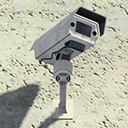
Camera. This widget displays a remote camera view in the world being played. (Only available for in-game panel effects.) | |
|
Check Box. This widget displays a check box that can be in the checked state or unchecked state. | |
|
Color Box. This widget displays a color selection box that displays a color picker dialog when clicked. | |
|
Configuration Table. This widget displays a configuration table that is used to show property settings to the user. | |
|
Editable Text Box. This widget displays an editable text box that allows a single line or multiple lines of text entry. | |
|
Frustum Viewport. This widget displays a viewport with a frustum camera. | |
|
Hyperlink. This widget displays a text button with a hyperlink. | |
|
Icon. This widget displays a vector icon. | |
|
Icon Button. This widget displays a button with a vector icon. | |
|
Image. This widget displays a plain texture image. | |
|
Image Button. This widget displays a button with a texture image. | |
|
Line. This widget displays a one-pixel-wide line that can be solid, dotted, or dashed. | |
|
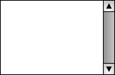
List. This widget displays a list box with a scroll bar. | |
|
Menu Bar. This widget displays a menu bar that allows the user to choose commands from pull-down menus. | |
|
Movie. This widget plays a movie resource. | |
|
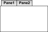
Multipane Box. This widget displays a multipane box. | |
|
Picture. This widget displays a vector picture. | |
|
Ortho Viewport. This widget displays a viewport with an orthographic camera. | |
|
Paint. This widget displays an interactive painting canvas. | |
|
Password. This widget displays a password entry box that obscures the text entered into it. | |
|
Popup Menu. This widget displays a popup menu. | |
|
Progress Bar. This widget displays a progress bar. | |
|
Push Button. This widget displays a button with a text string. | |
|
Quad. This widget displays a plain colored quad. | |
|
Radio Button. This widget displays a radio button that can be in the selected or unselected state. | |
|
Scroll Bar. This widget displays a scroll bar. | |
|
Slider. This widget displays a slider. | |
|
Stroke. This widget displays a vector line with optional cap styles and dashing. | |
|
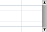
Table. This widget displays a table with a fixed number of columns in a box with a scroll bar. | |
|
Text. This widget displays a plain text string. | |
|
Text Button. This widget displays a clickable text string. | |
|
Tree. This widget displays a list box with a scroll bar, and the items can have collapsable subtrees. | |
|
World Viewport. This widget renders a complete world inside a frustum viewport, and the it provides camera orbit functionality. |
